Graphic Design & Marketing Intern
During my internship at Waiting Room Publishing, I worked on magazine layouts, website design and marketing materials that strengthened the brand’s visual identity and digital presence.
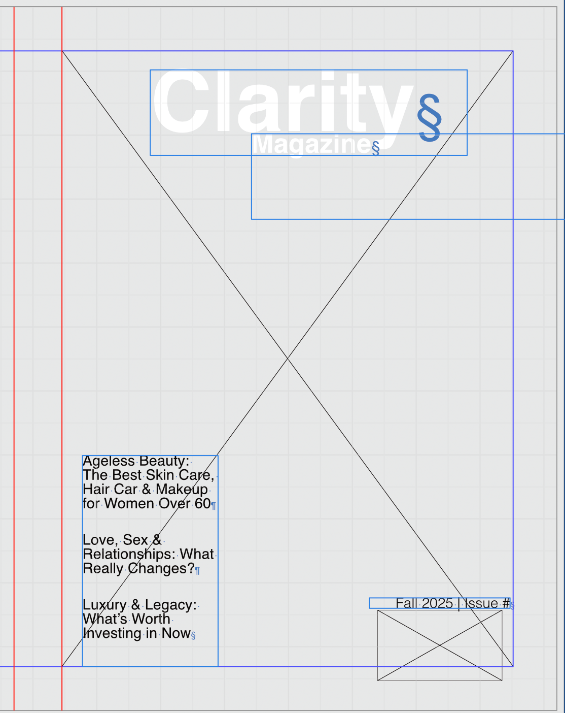
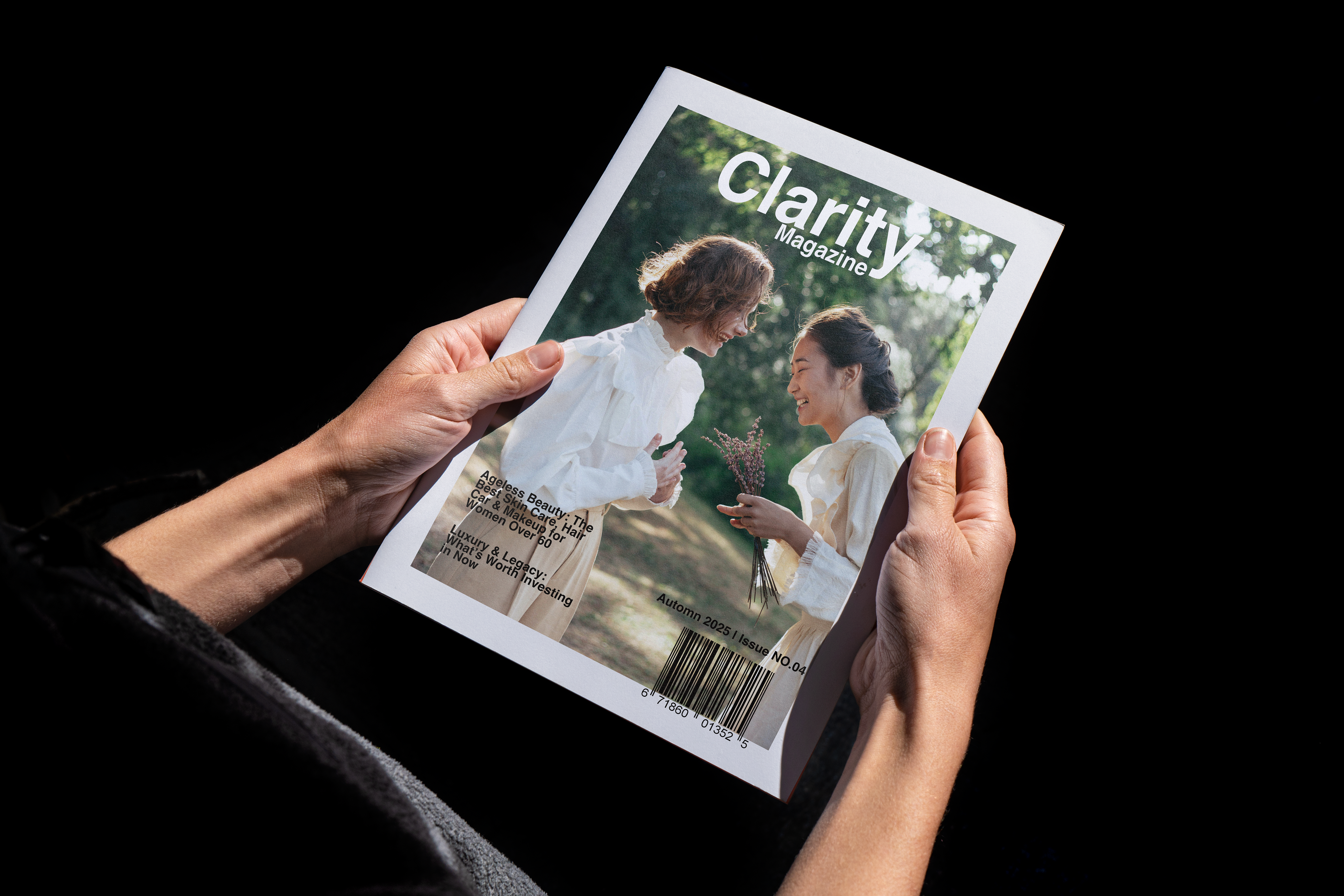
Magazine Design
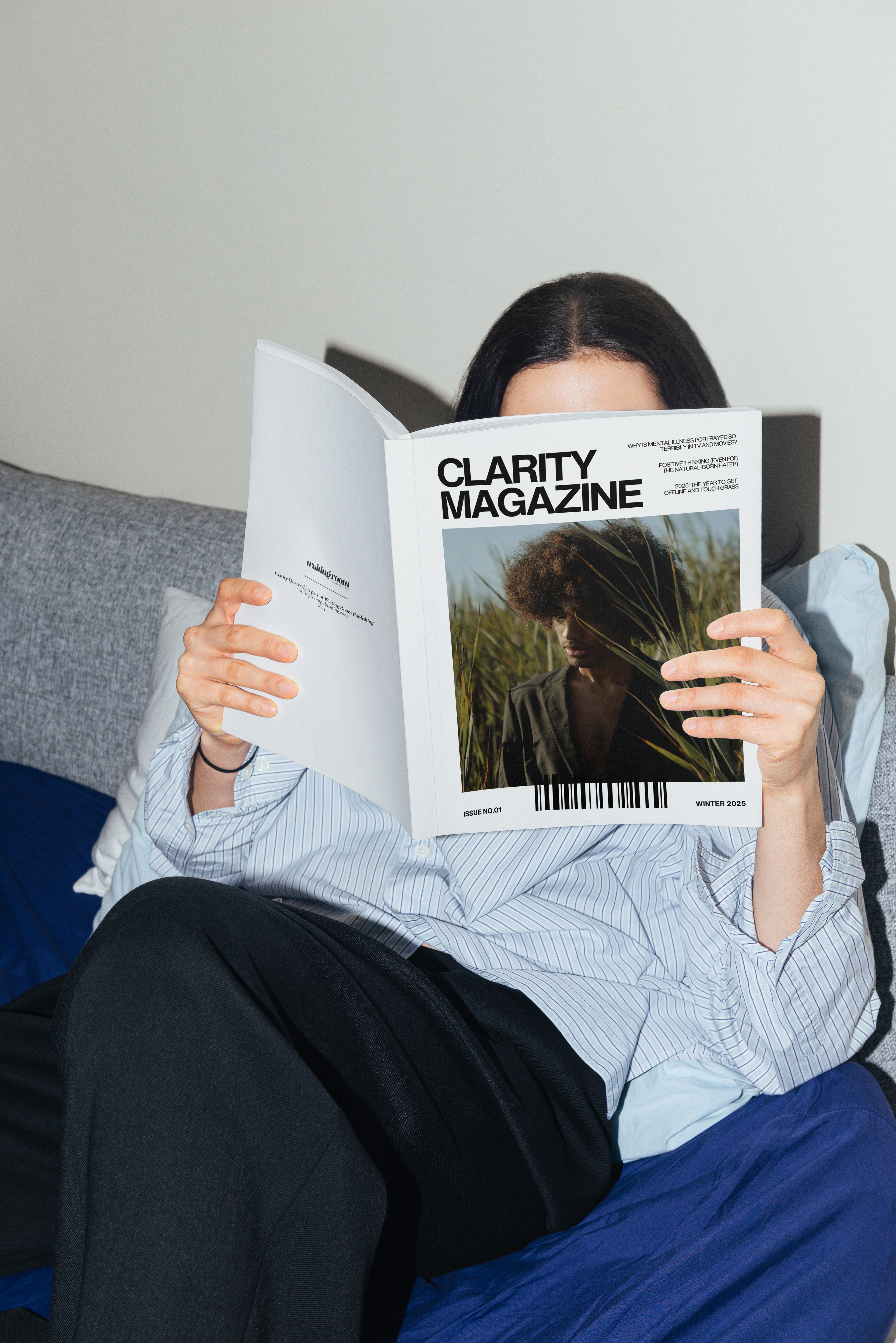
For Clarity Magazine, I designed the cover to reflect its identity: approachable, smart, and rooted in real-life experiences. The masthead Clarity set in a bold sans-serif, ensures strong brand recognition with a clean aesthetic. The main image—two women sharing a candid moment—captures the magazine’s mission of promoting wellness and connection without pretension. Supporting cover lines sit along the lower half, balancing space and readability while highlighting themes of beauty, legacy, and lifestyle. With the barcode and issue details anchoring the bottom, the design delivers a polished, professional look that mirrors Clarity’s voice: cool, welcoming, and sophisticated.
“Surviving After a Moment” Spread Design
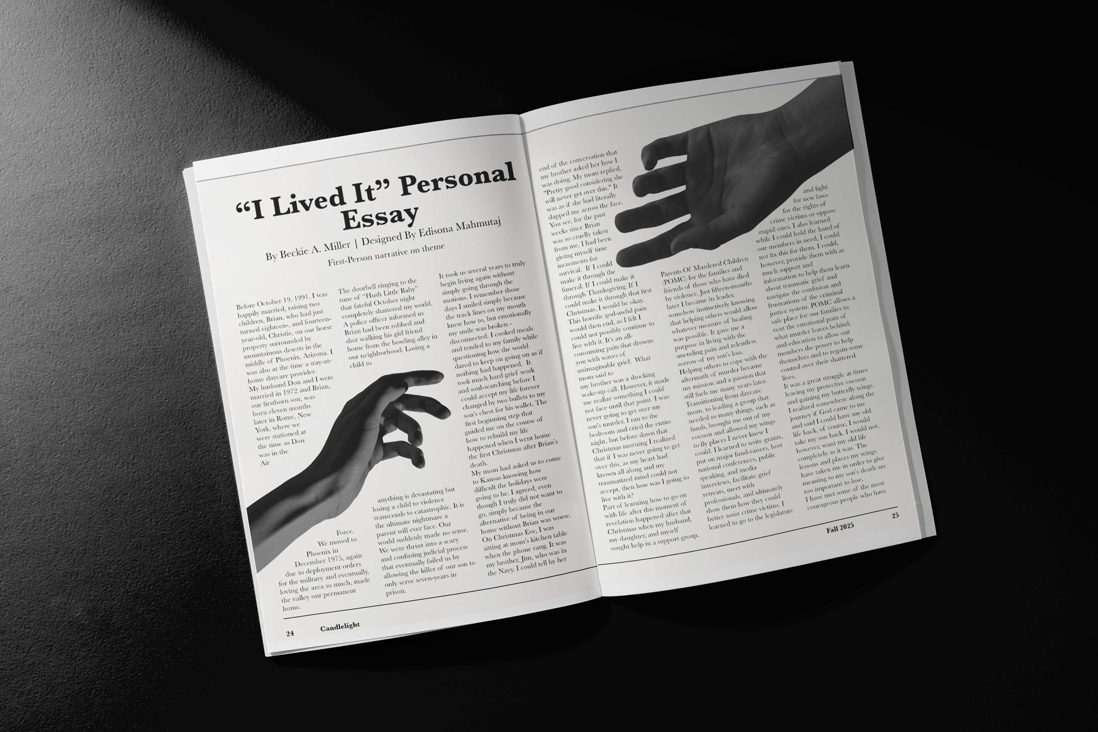
For this personal essay layout, I focused on visually reinforcing the author’s theme of loss and separation. The line “Brian was so cruelly taken from me” inspired the central imagery: two hands reaching toward one another, yet drifting apart—one ascending into the sky, symbolizing absence and loss.
To seamlessly integrate the visuals with the text, I rasterized the hands so the body copy could flow around them. This creates a more immersive reading experience where the image doesn’t interrupt but instead interacts with the narrative. The grayscale treatment of the hands enhances the emotional weight of the story, keeping the tone somber and reflective, while also ensuring readability of the text.
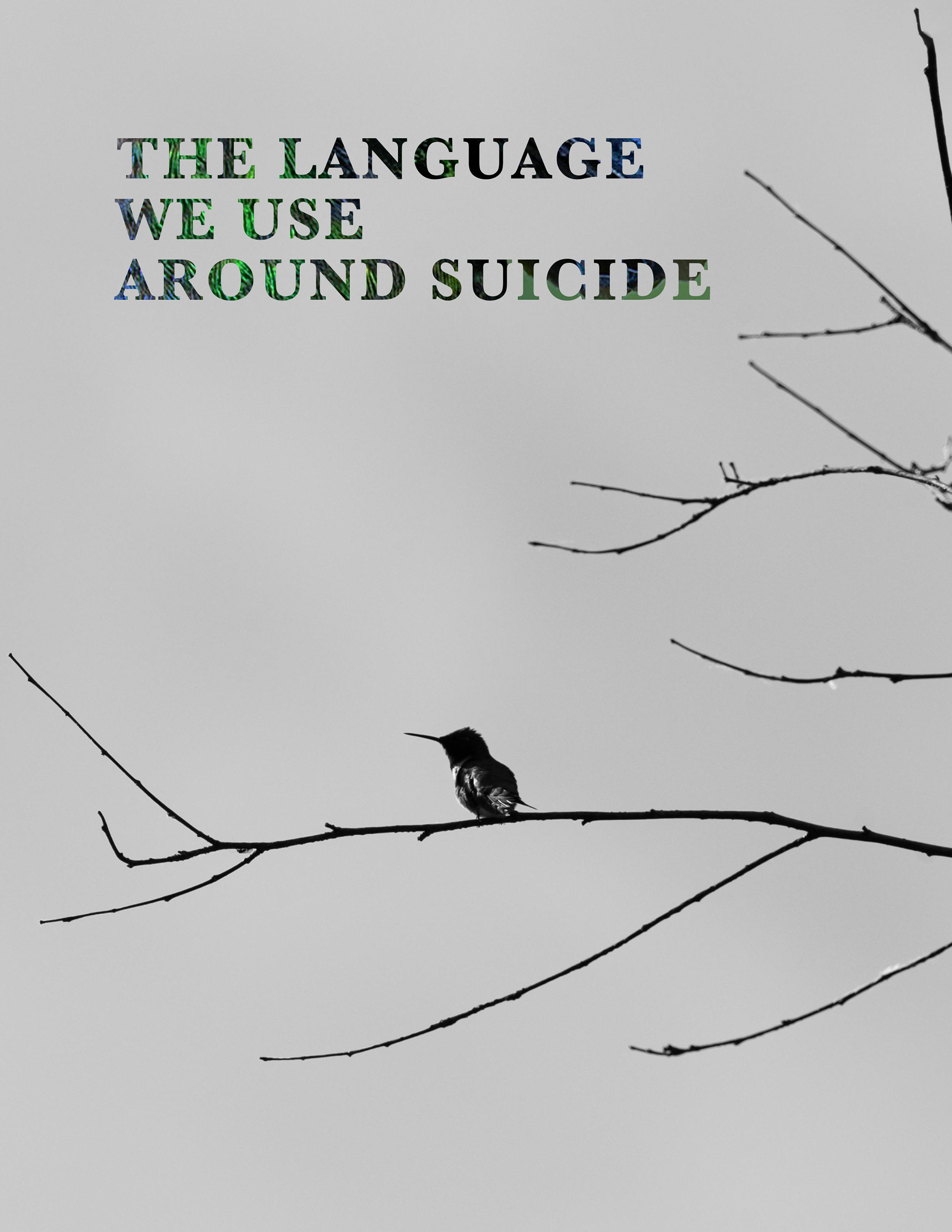
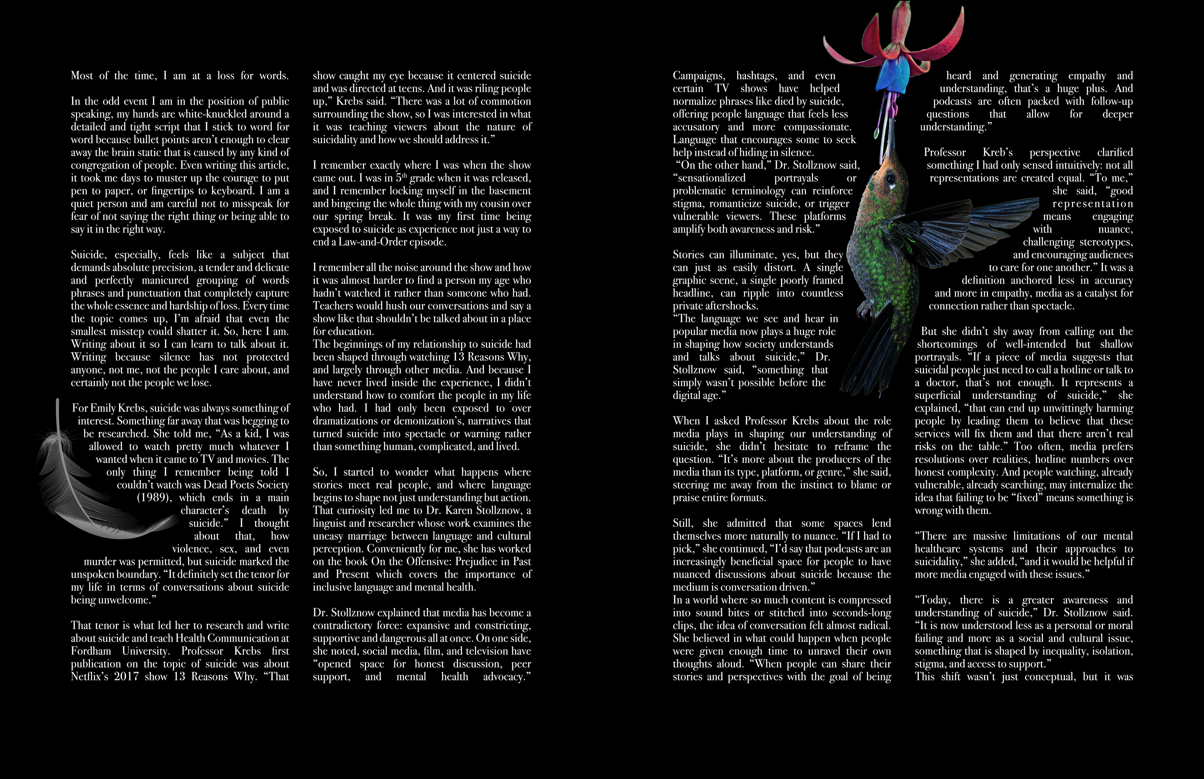
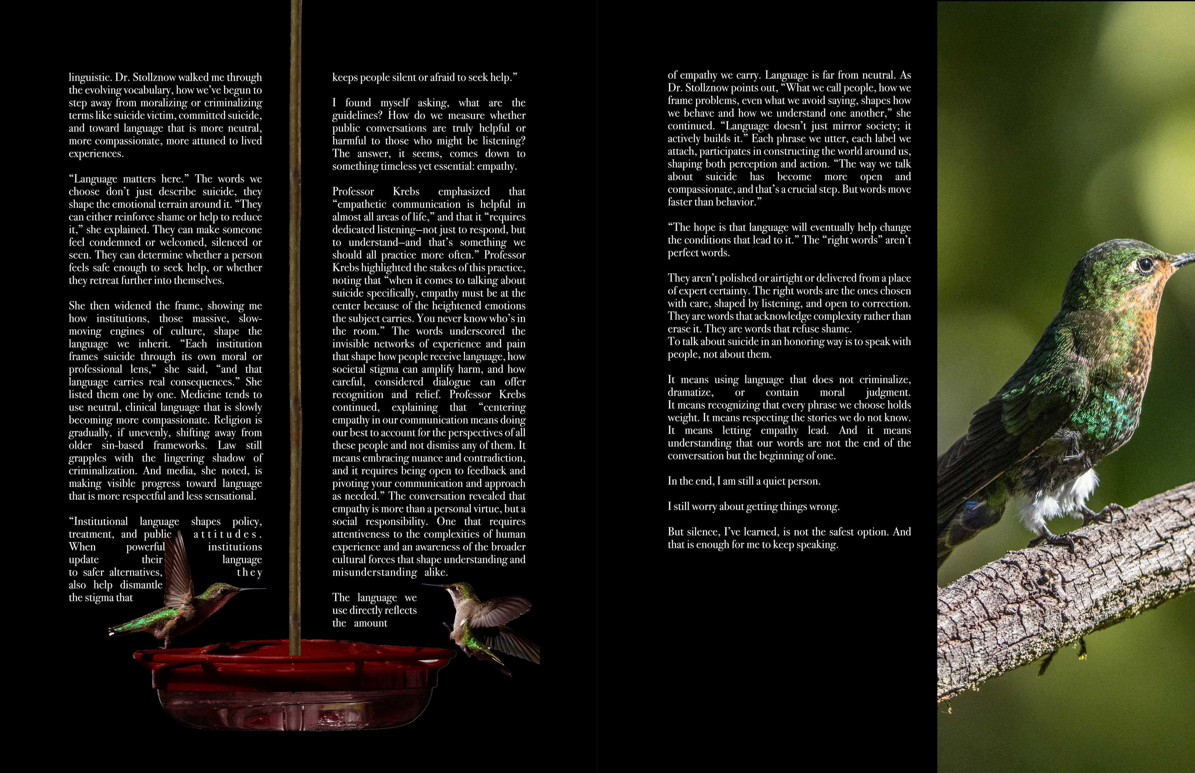
How To Say the Right Thing
This piece uses hummingbirds as a visual metaphor for resilience, connection, and survival. Hummingbirds are delicate, yet endlessly persistent — small bodies carrying incredible strength. In the context of suicide awareness and the language surrounding it, they represent those who continue to move through life even when it feels heavy or painful.
A single feather falls, symbolizing fragility, loss, and the moments when someone feels like they are slipping away.
The two birds face each other, sharing space, movement, and presence. They illustrate one of the core truths of this work: no one should carry their pain alone.
This design reflects the importance of support and compassion — the act of showing up for one another, especially when words feel impossible. It speaks to the power of connection in difficult times and visualizes what language sometimes fails to express:
I’m here. You are not alone.
I’m here. You are not alone.
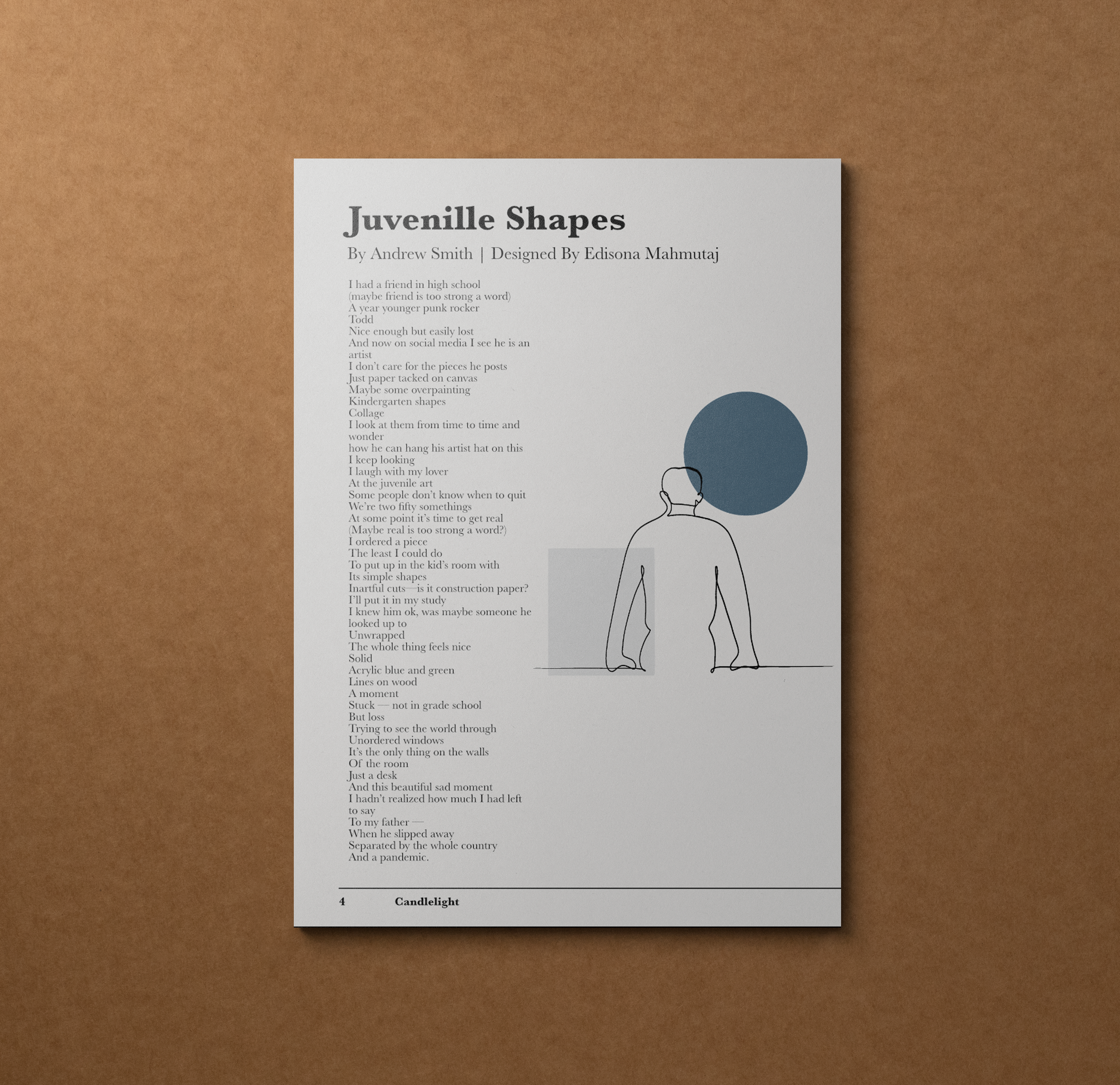
Juvenile Shapes - Poetry Spread Design
For this poetry spread, I combined a minimalist one-line drawing of a man with abstract geometric shapes in muted tones from the magazine’s palette. The shapes serve as a visual reference to the “kindergarten shapes” and collage-like artworks described in the poem, echoing the speaker’s reflection on juvenile art and memory. This interplay between text and imagery creates a contemplative, modern layout where the visuals amplify the poem’s themes of nostalgia, loss, and the search for meaning in simple forms.
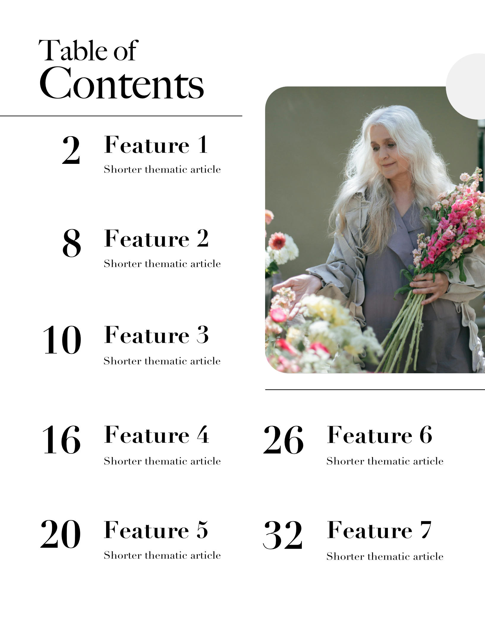
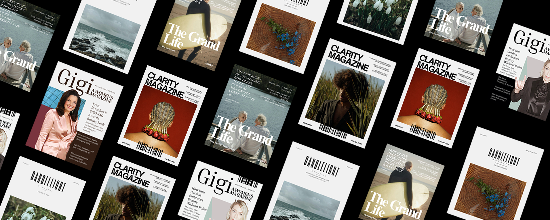
Magazine Layout Design
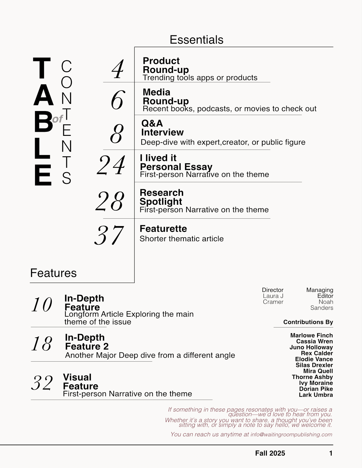
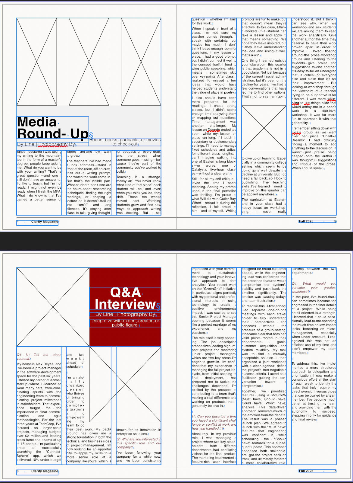
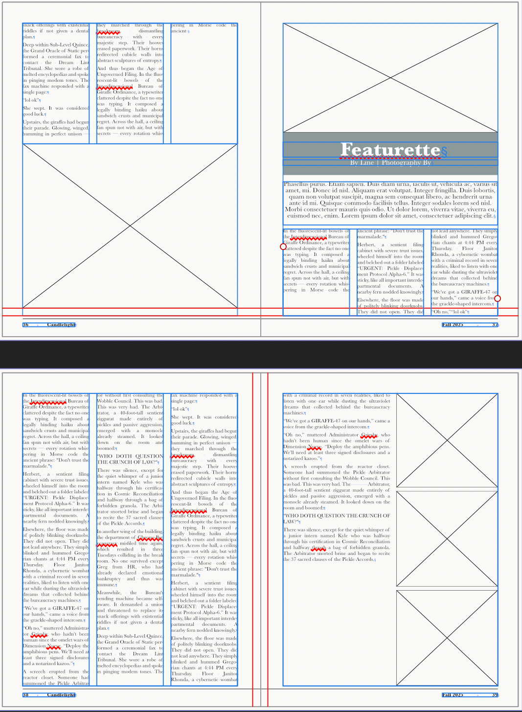
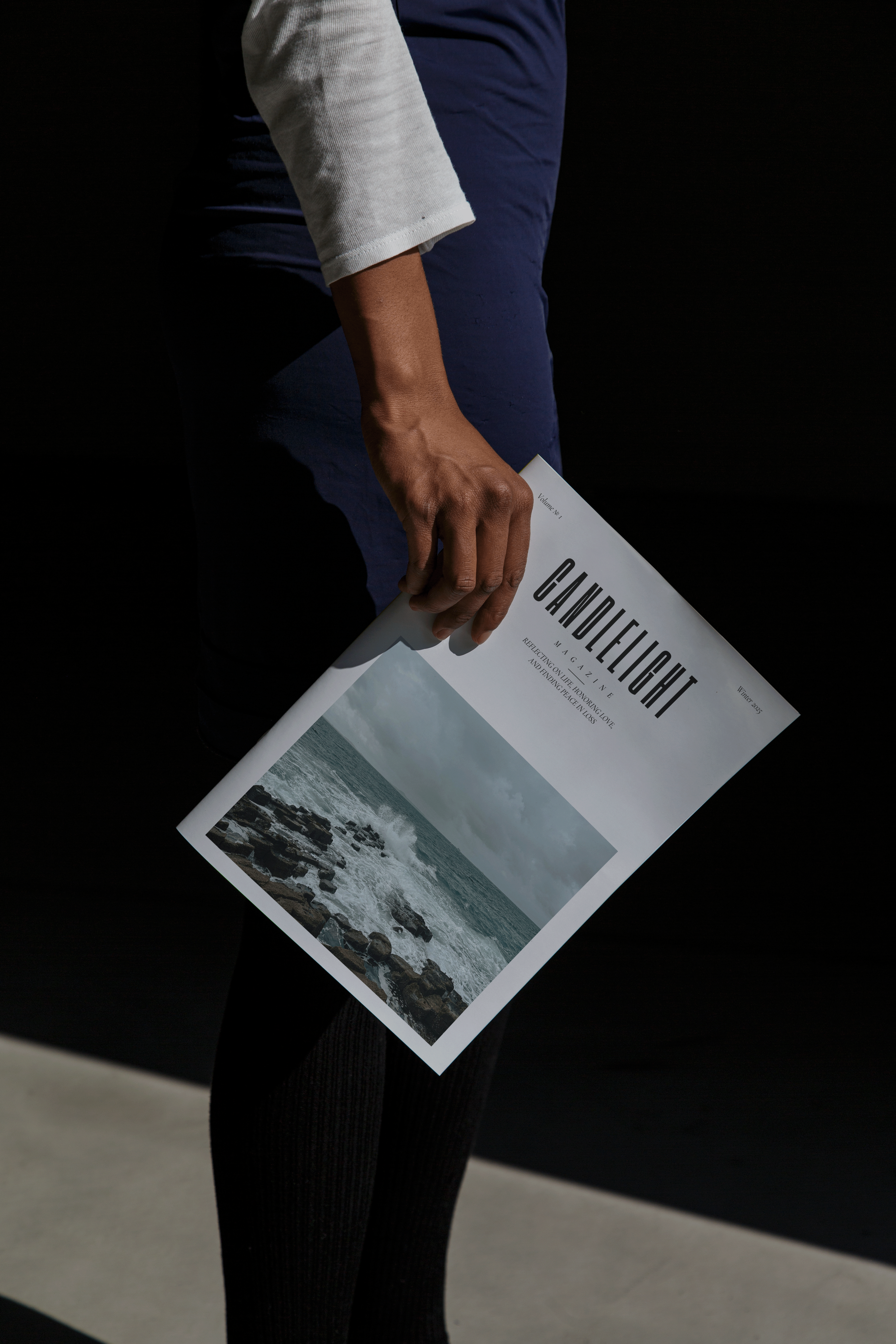
I designed full editorial layouts for Clarity Magazine, Candlelight, and The Grand Life, including their tables of contents. Each 50-page issue follows the brand book guidelines, applying specific typefaces, color palettes, and tonal direction while meeting design specs, production standards, and standard editorial layout requirements. The final designs reflect cohesive, publication-ready magazines that balance clarity, consistency, and reader engagement.
Catalog 2025 (Digital Version)
Website Updates (Shopify)
Created all supporting visuals, including banners and product mockups, to give the page a cohesive look.
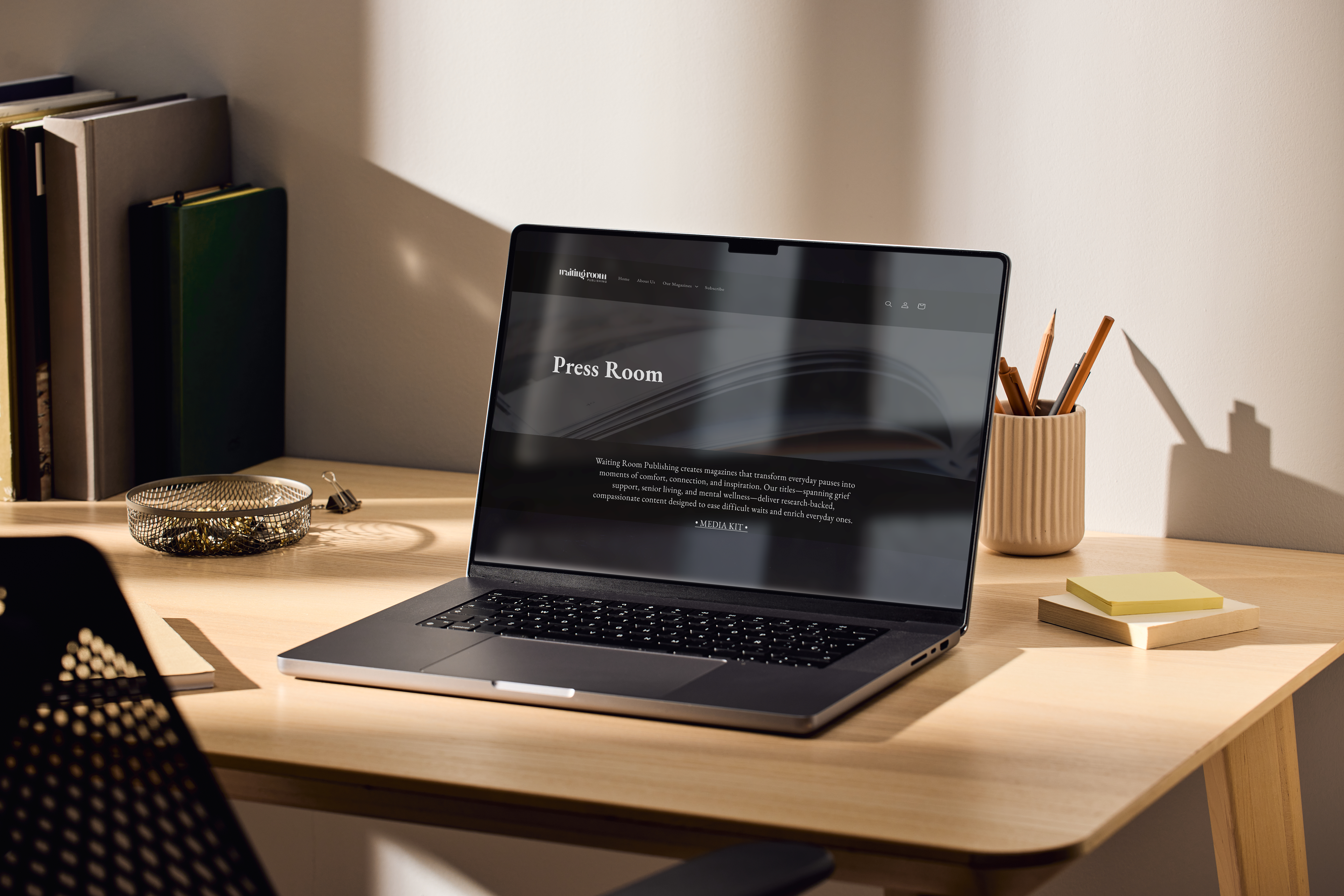
Press Page
Linkedin posts