Soléa — Blueberry + White Peach
A second wave of Soléa,
where the brand drifts closer to minimalism and ocean air.
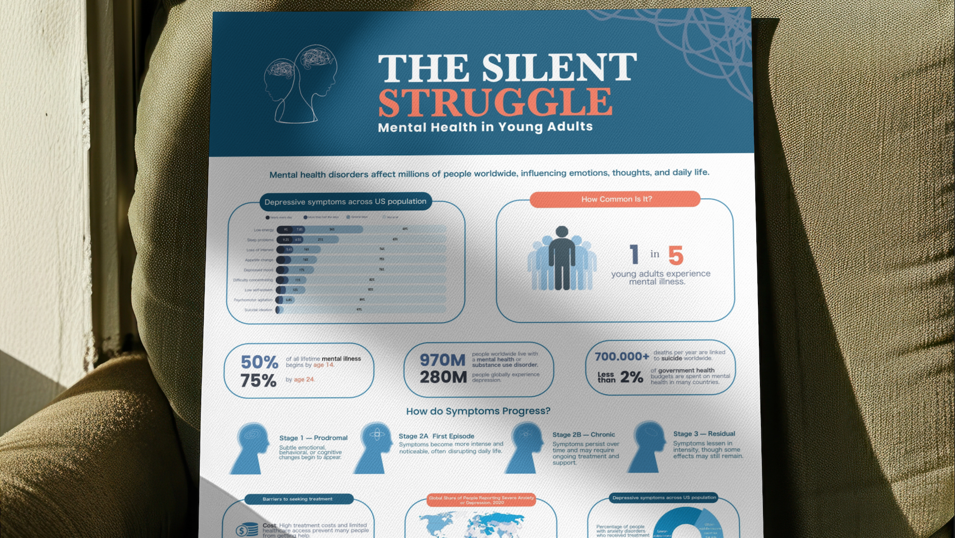
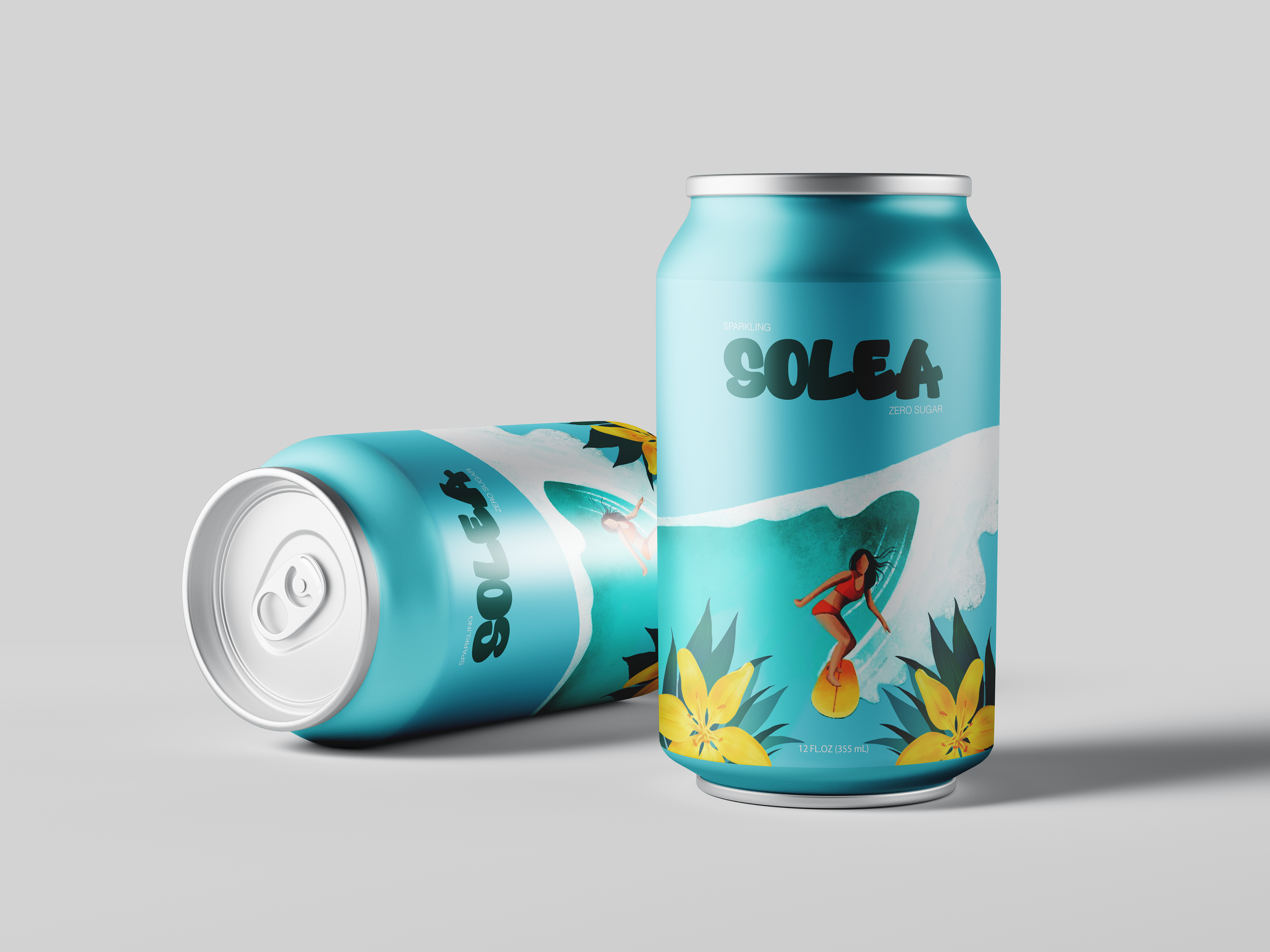
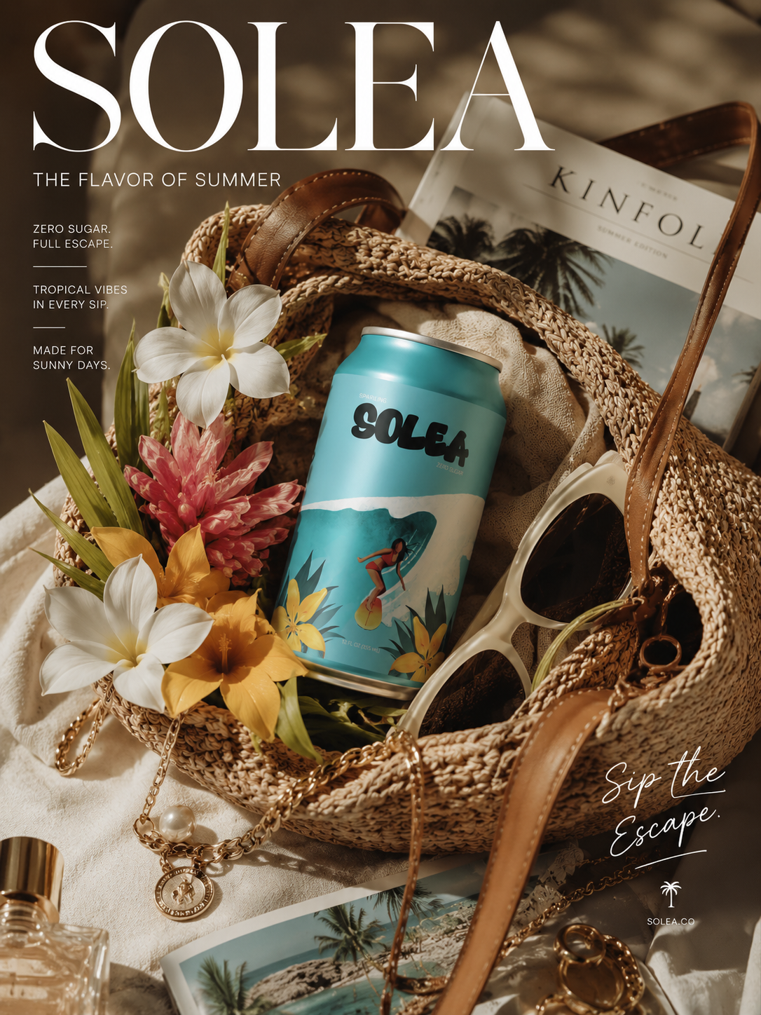
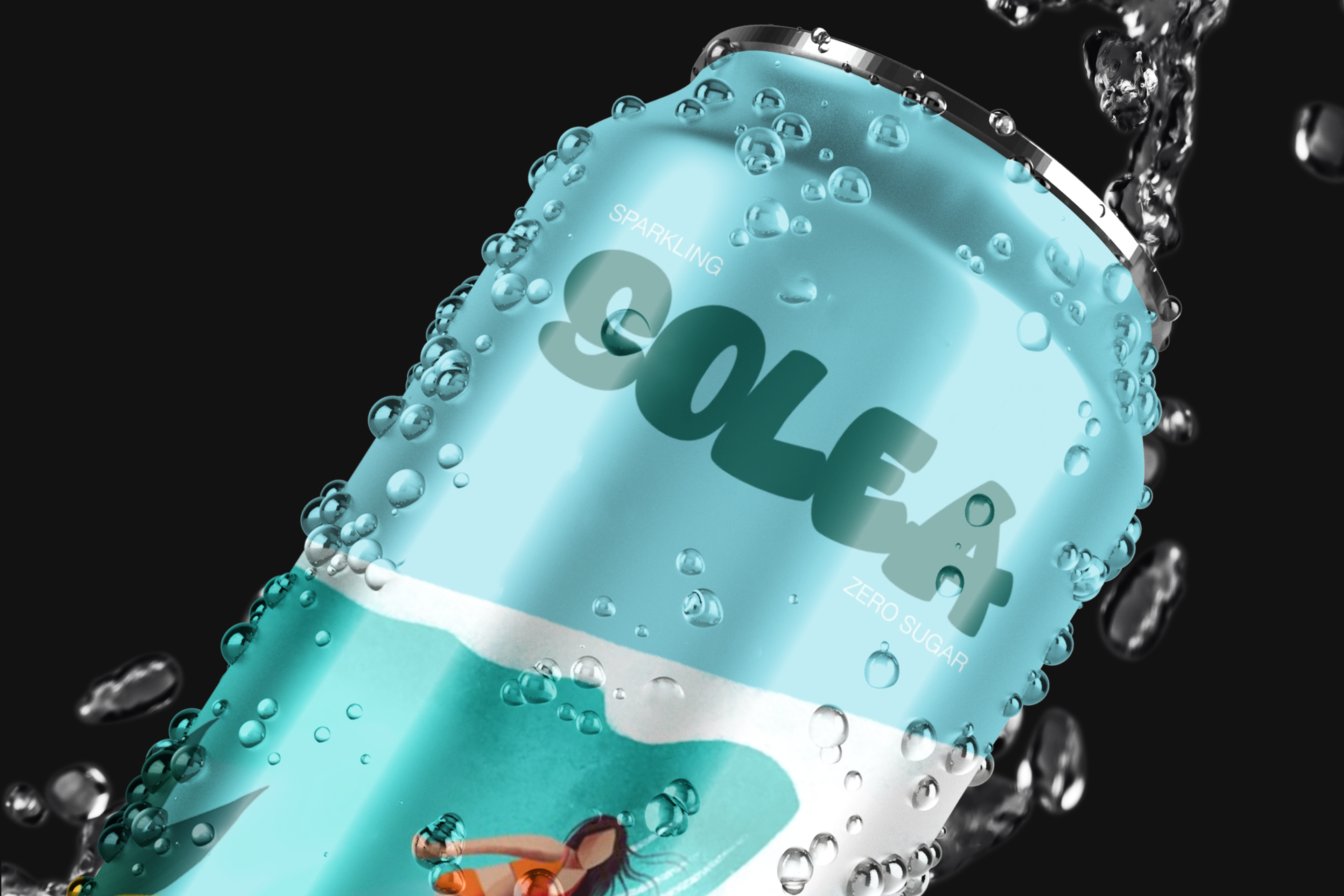
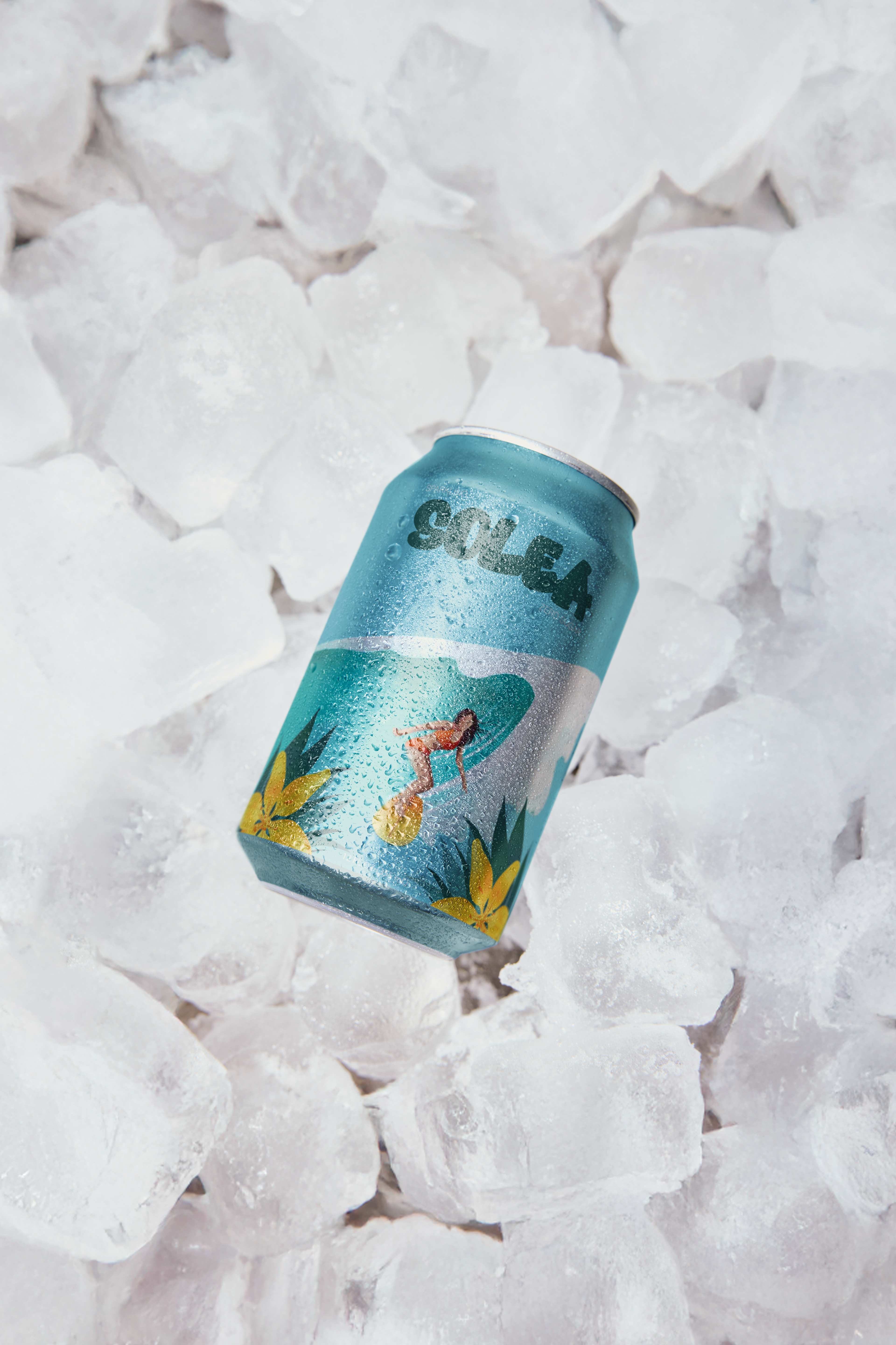
A conceptual beverage design for Solea, reimagined as a soft, sunlit sparkling soda. This edition explores a more delicate and elegant expression of the brand — a zero-sugar drink designed to feel light, glossy, and effortlessly refreshing.
DESIGN APPROACH
Color Palette
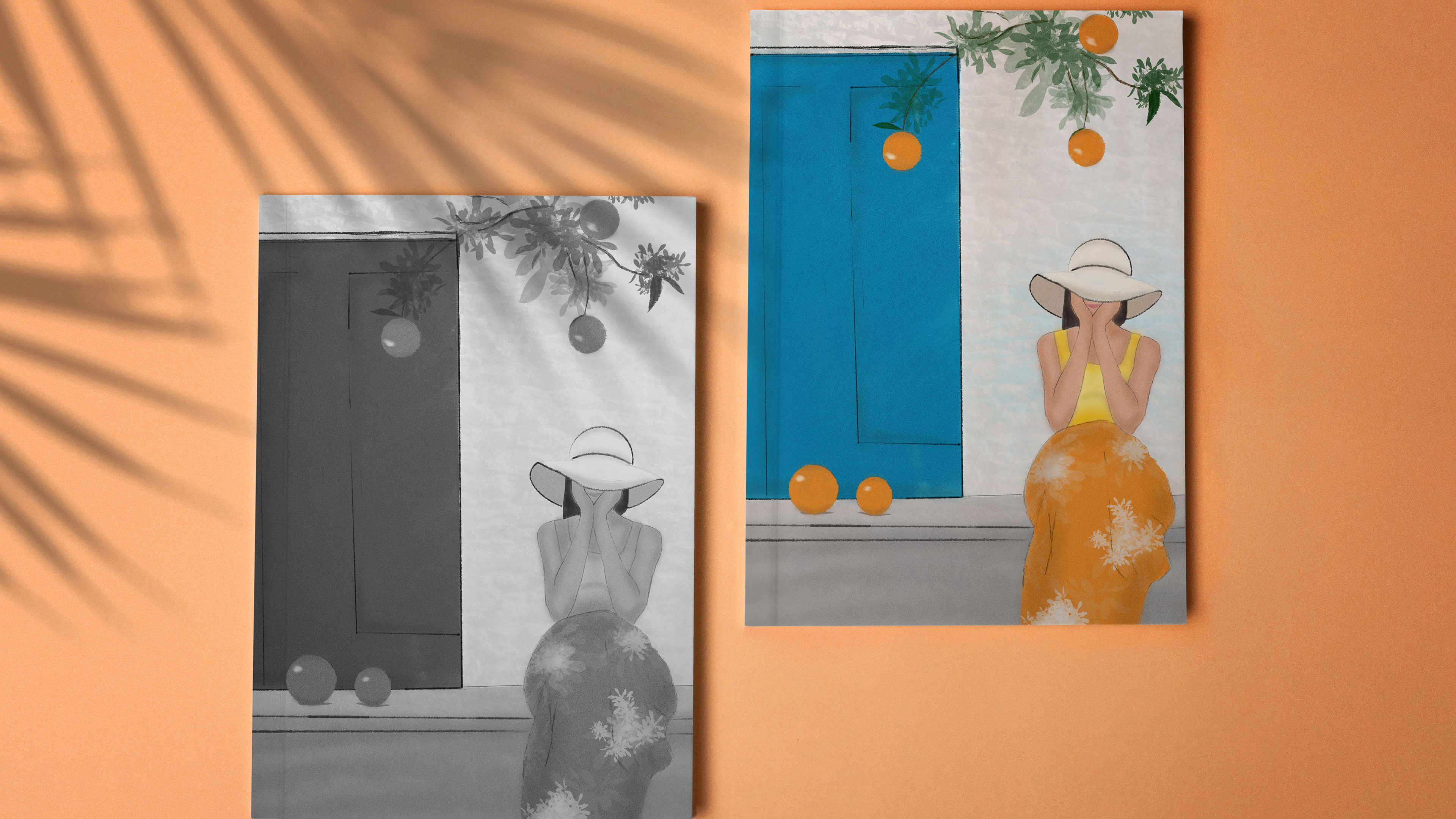
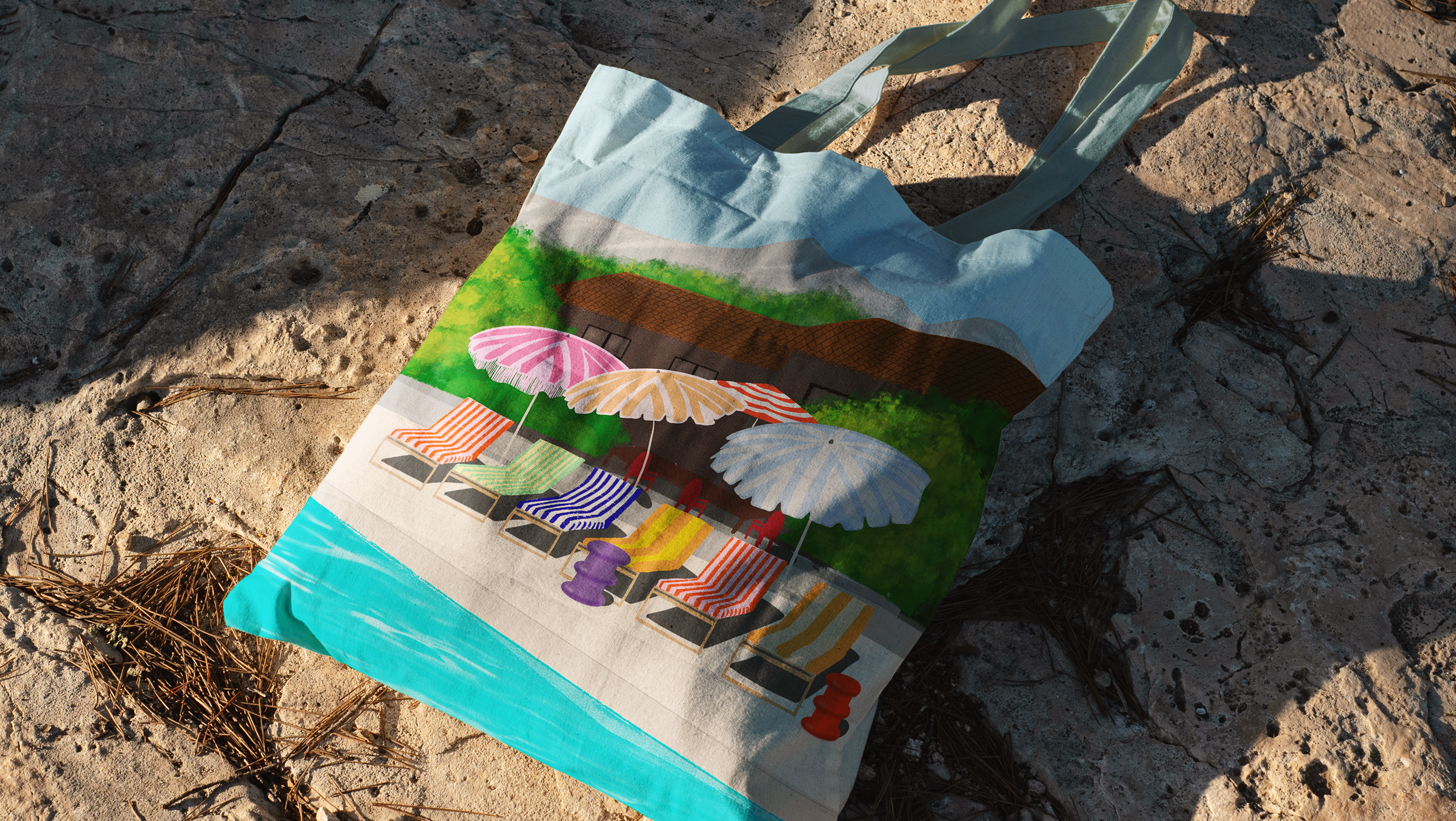
A turquoise base is balanced with warm yellow and soft orange tones, creating a bright yet gentle contrast. The palette leans into a sunlit atmosphere, where cool freshness meets golden warmth. The result feels airy and luminous, with a focus on light rather than intensity.
A turquoise base is balanced with warm yellow and soft orange tones, creating a bright yet gentle contrast. The palette leans into a sunlit atmosphere, where cool freshness meets golden warmth. The result feels airy and luminous, with a focus on light rather than intensity.
Imagery
soft, minimal accents that communicate taste in an immediate but refined way. Subtle floral details drift through the composition, adding a sense of lightness and movement without overwhelming the scene.
soft, minimal accents that communicate taste in an immediate but refined way. Subtle floral details drift through the composition, adding a sense of lightness and movement without overwhelming the scene.
Typography & Layout
A minimal, contemporary layout allows the visuals to breathe, emphasizing clarity and calm. The composition is spacious and balanced, reinforcing the drink’s soft, sun-washed character.
A minimal, contemporary layout allows the visuals to breathe, emphasizing clarity and calm. The composition is spacious and balanced, reinforcing the drink’s soft, sun-washed character.
Logo Design
A bubbly typeface defines the Solea logo — rounded, playful, and slightly effervescent, echoing the feeling of carbonation. It brings a sense of freshness and personality while still feeling clean and modern.
A bubbly typeface defines the Solea logo — rounded, playful, and slightly effervescent, echoing the feeling of carbonation. It brings a sense of freshness and personality while still feeling clean and modern.
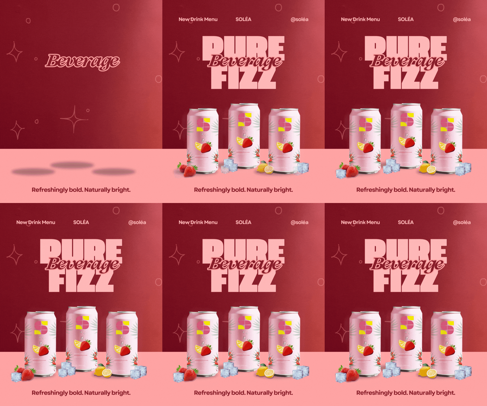
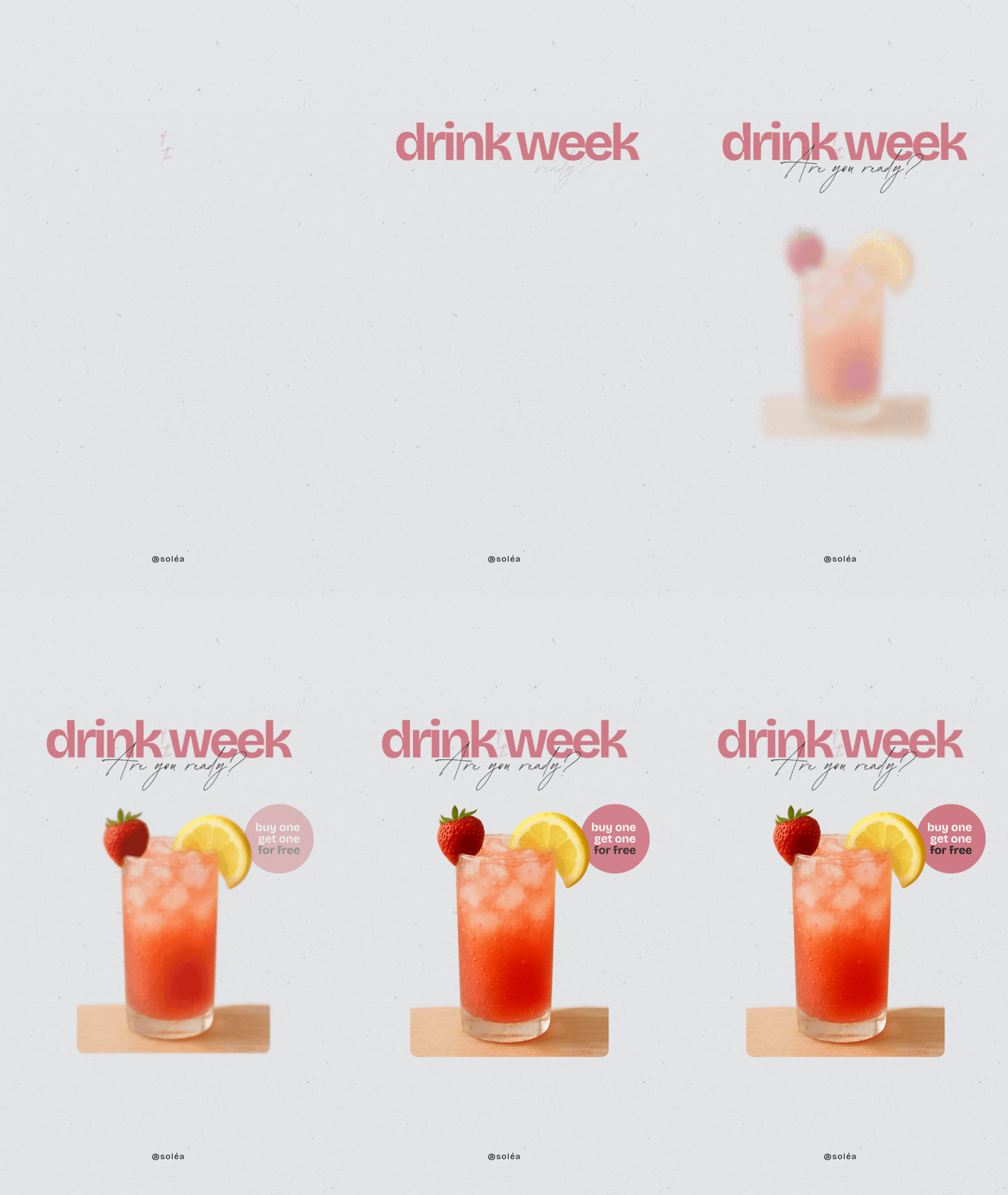
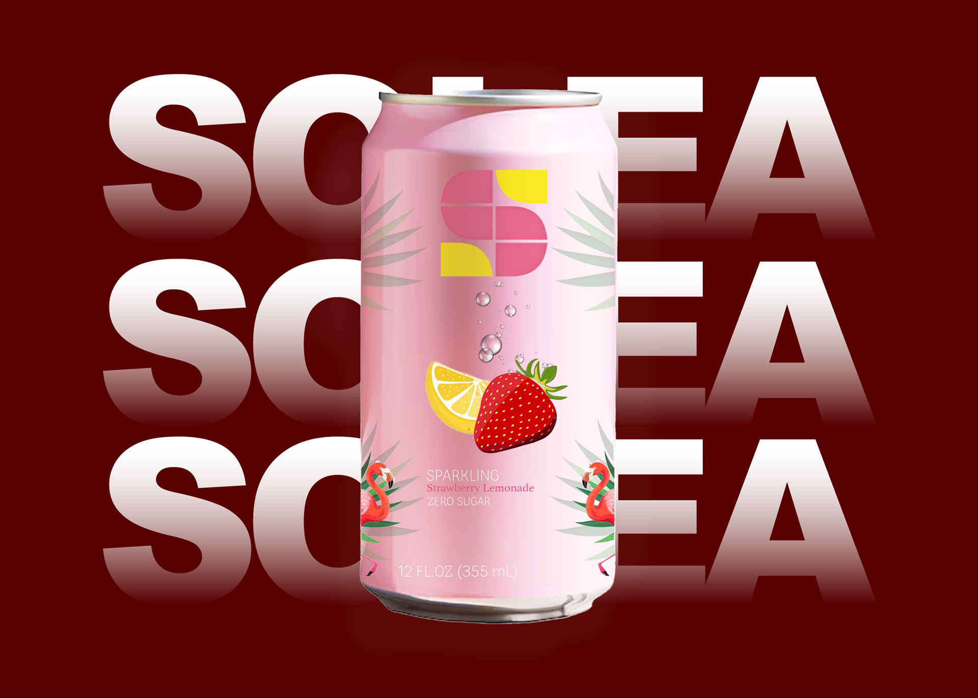
SOLÉA - Strawberry Lemonade
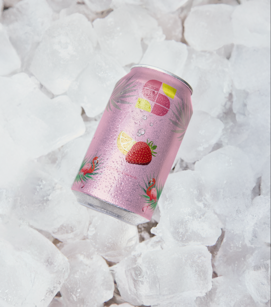
A conceptual beverage design for Solea, reimagined as a vibrant, zero-sugar sparkling strawberry lemonade. This edition captures a brighter, more playful side of the brand — rooted in freshness, energy, and a modern health-conscious lifestyle without sacrificing bold flavor.
DESIGN APPROACH
Color Palette
A soft pink base sets a sweet, airy tone, balanced by crisp accents of yellow and fresh green. The combination creates a sense of brightness and contrast, evoking the feeling of chilled fruit and summer light.
A soft pink base sets a sweet, airy tone, balanced by crisp accents of yellow and fresh green. The combination creates a sense of brightness and contrast, evoking the feeling of chilled fruit and summer light.
Imagery
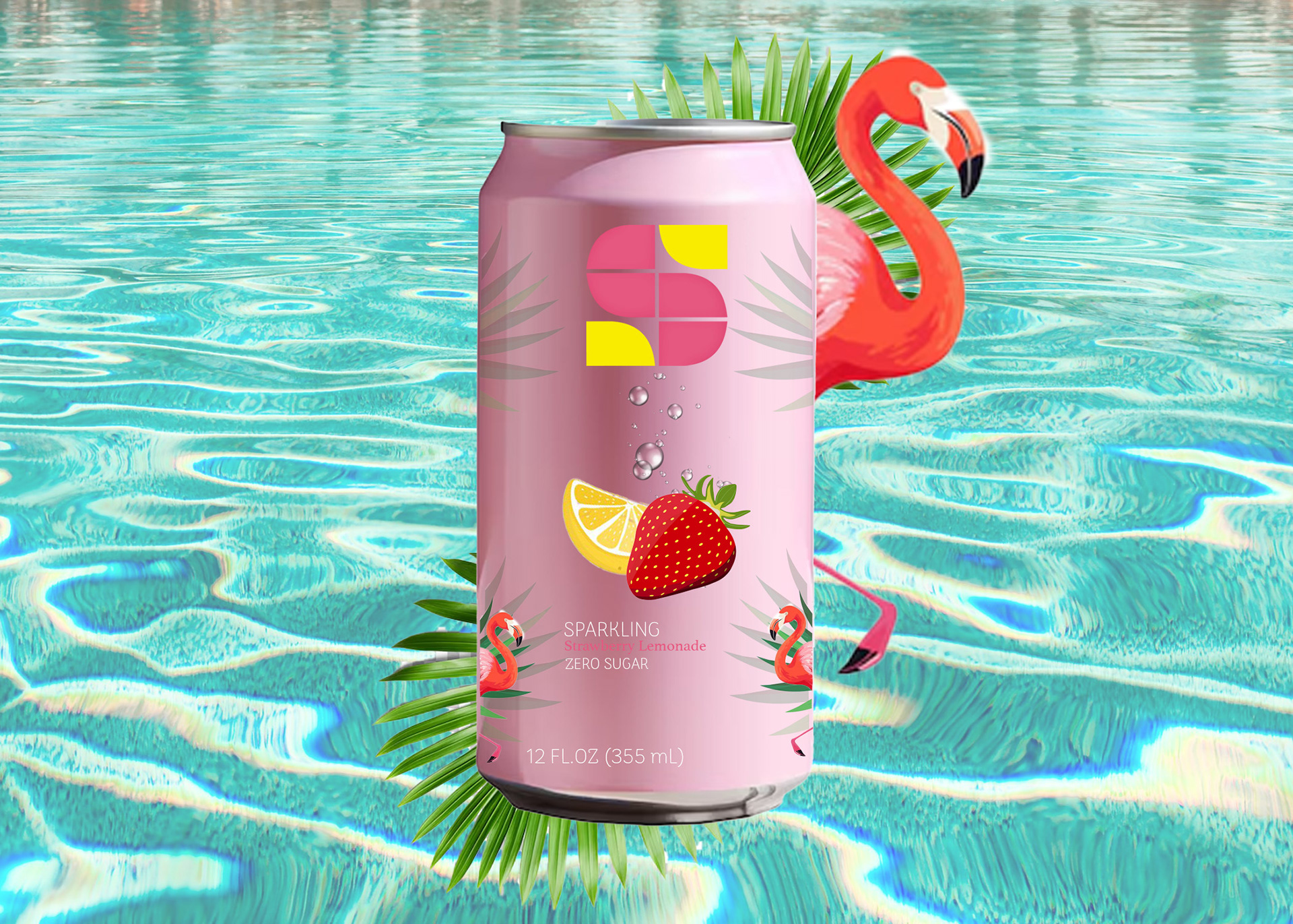
Strawberries and lemons are used as direct flavor cues, immediately communicating the drink’s profile. Subtle tropical elements like palm leaves and flamingos introduce a playful, seasonal personality, giving the composition a light, expressive rhythm without overwhelming the product.
Strawberries and lemons are used as direct flavor cues, immediately communicating the drink’s profile. Subtle tropical elements like palm leaves and flamingos introduce a playful, seasonal personality, giving the composition a light, expressive rhythm without overwhelming the product.
Typography & Layout
The typography is minimal and contemporary, designed to stay unobtrusive and refined. Clean spacing allows the visual elements to breathe, keeping the focus on the freshness of the drink and the clarity of the concept.
The typography is minimal and contemporary, designed to stay unobtrusive and refined. Clean spacing allows the visual elements to breathe, keeping the focus on the freshness of the drink and the clarity of the concept.
Logo Design
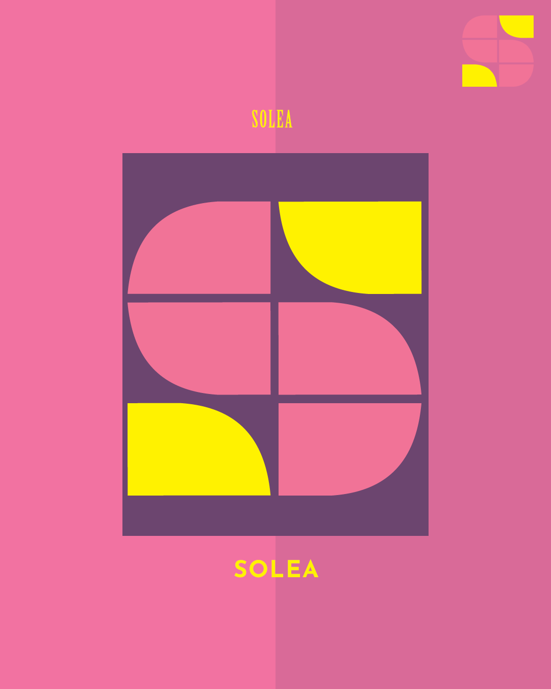
A geometric “S” symbol anchors the identity — simple, bold, and instantly recognizable. It balances softness with structure, acting as a modern mark that can stand alone across packaging and campaigns.
A geometric “S” symbol anchors the identity — simple, bold, and instantly recognizable. It balances softness with structure, acting as a modern mark that can stand alone across packaging and campaigns.
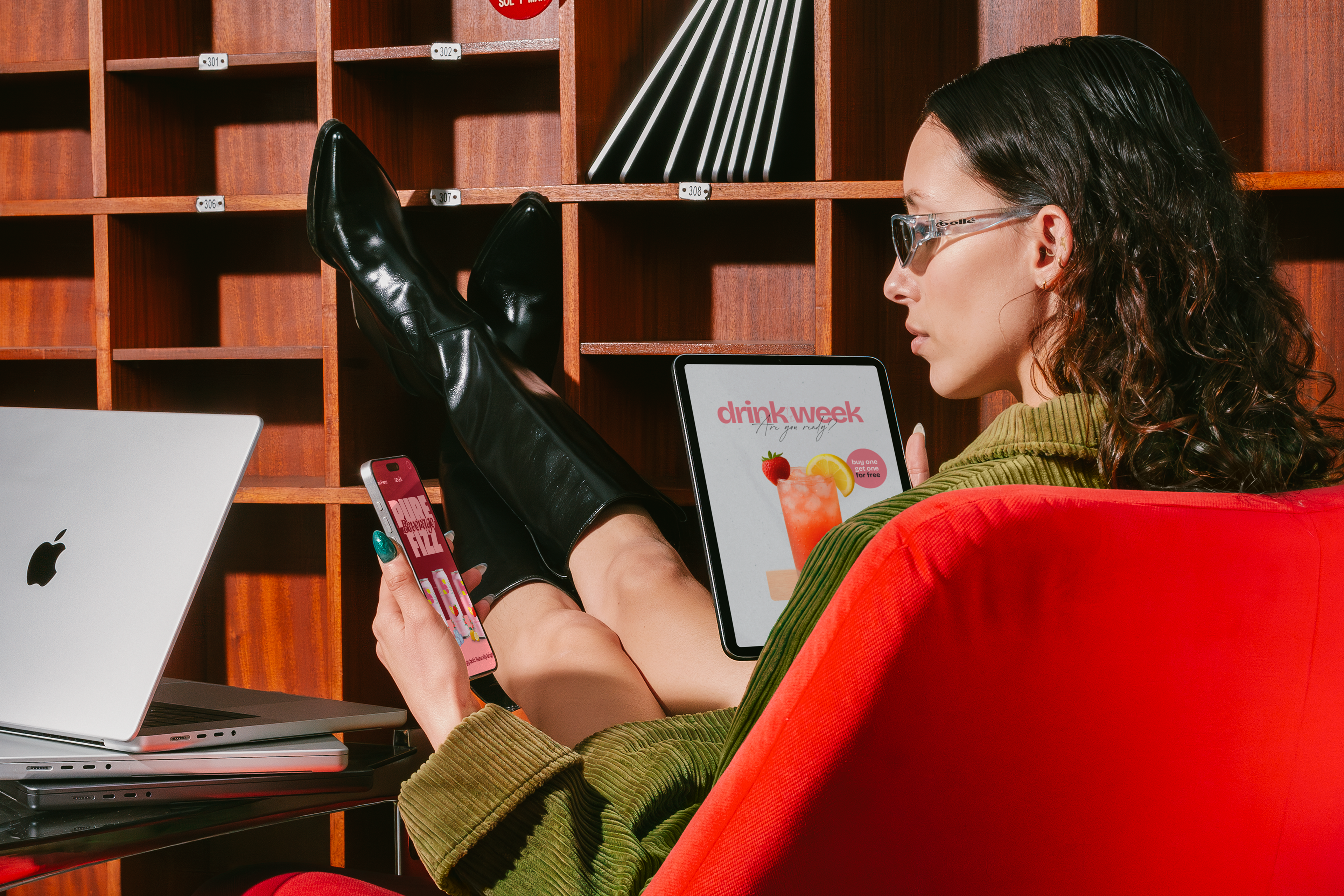
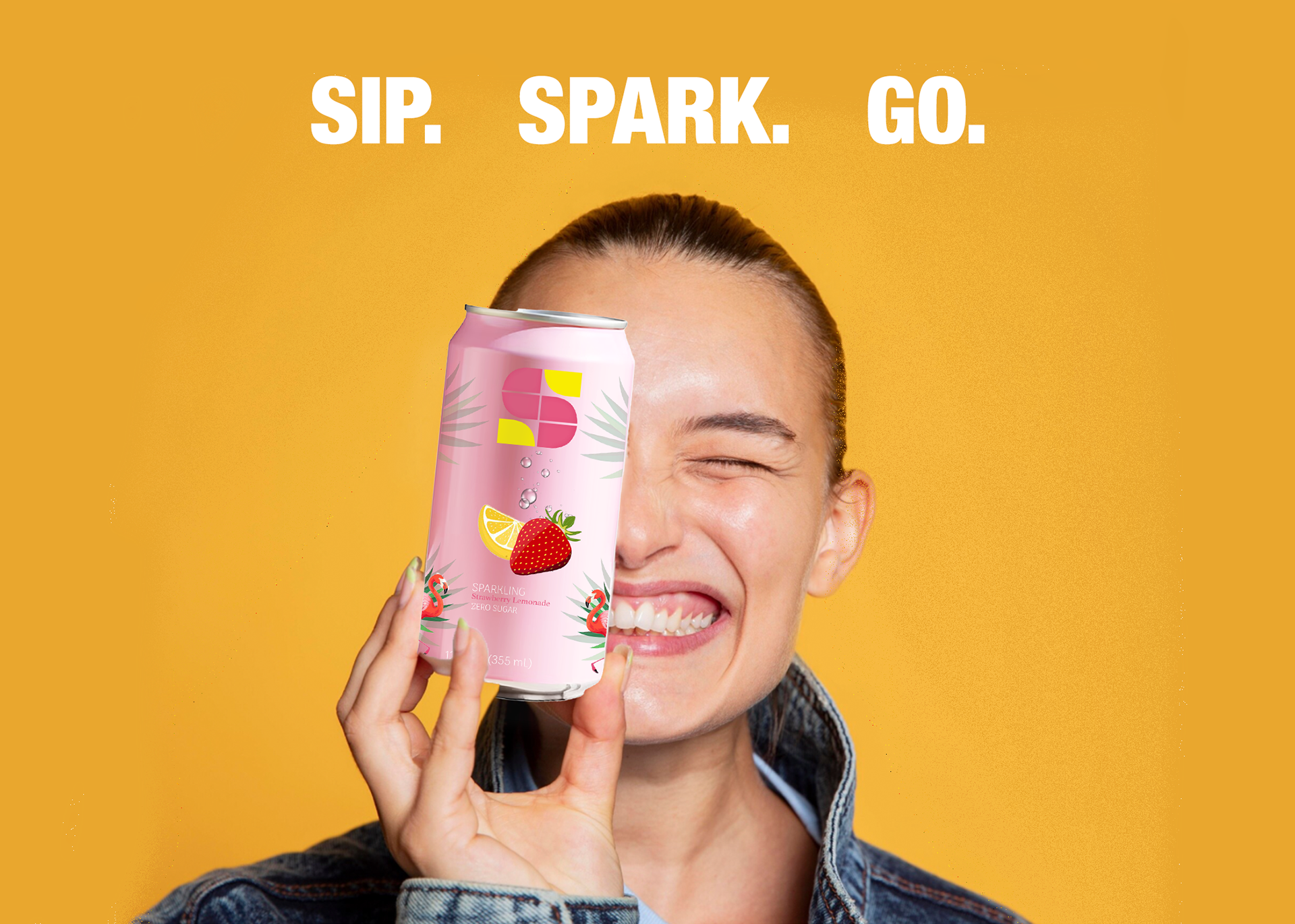
The tagline “Sip. Spark. Go.” captures Solea in three words: refreshment, energy, and movement. It positions the drink as a zero-sugar companion for an active, on-the-go lifestyle without losing flavor or fun.
The ad uses a bold, minimal composition with a bright yellow background that radiates energy and positivity. A smiling model reinforces Solea’s playful, feel-good identity and lifestyle-driven appeal.