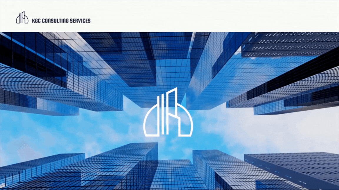
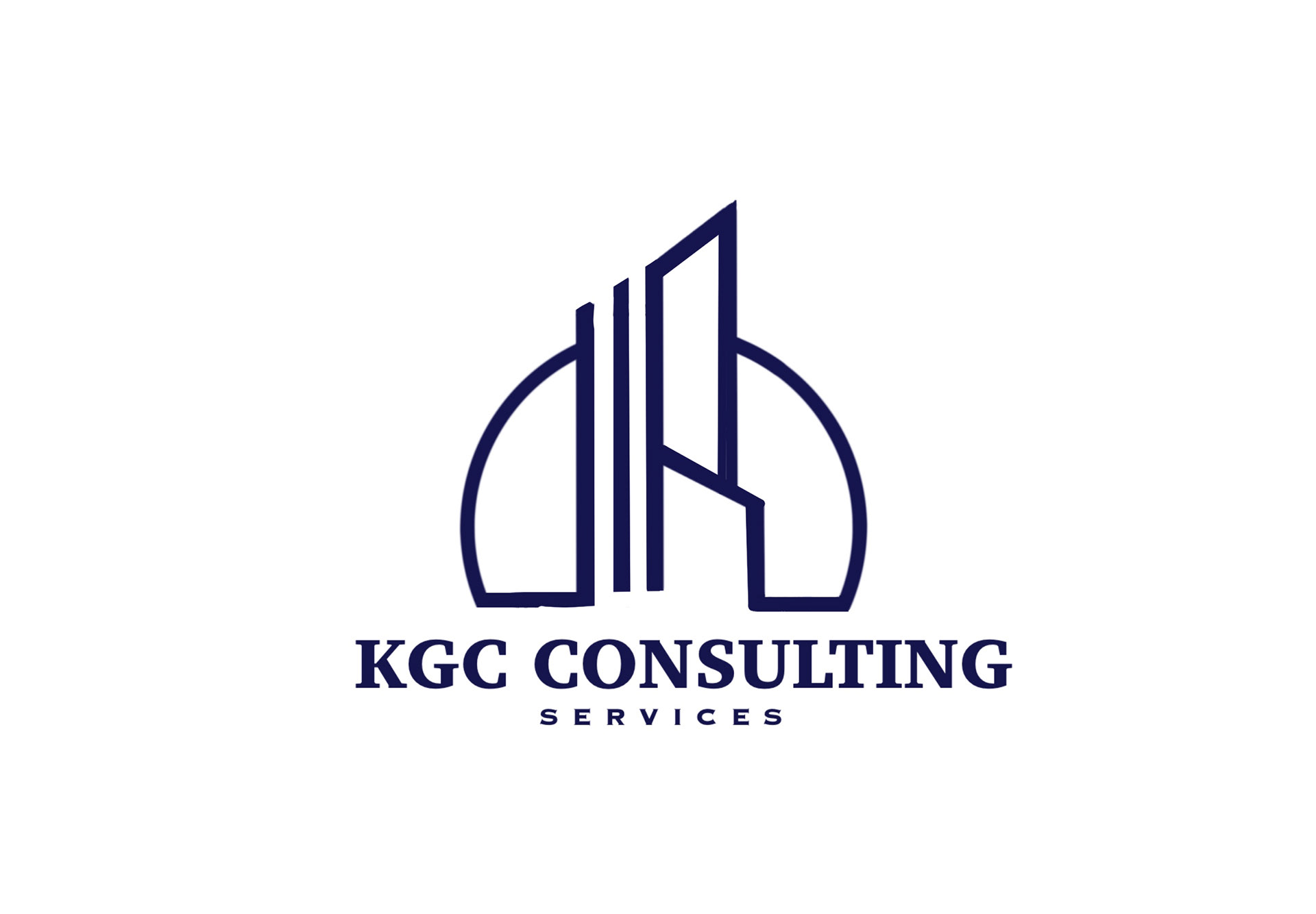
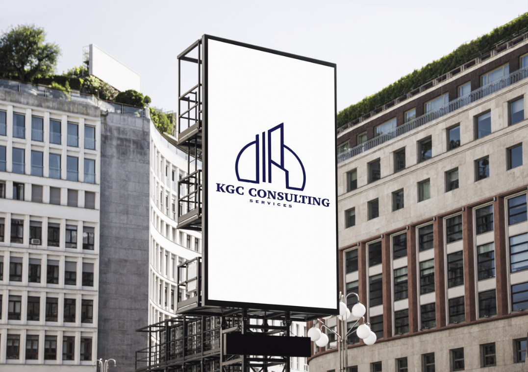
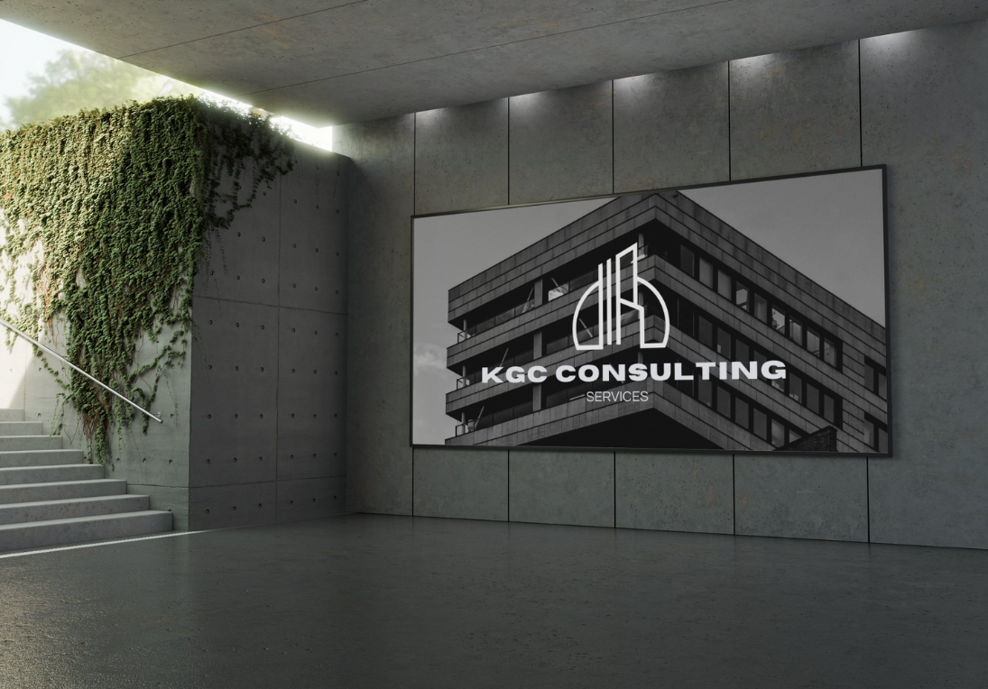
The logo is a creative representation of the company name, KGC, where the letter “K” is designed to resemble a series of buildings. This reflects the company’s focus on commercial and industrial construction, visually connecting the brand to its field of expertise. The buildings vary in height and shape, adding a dynamic and modern feel that suggests growth, stability, and innovation.
To unify the elements, a half-circle arcs around the “K,” grounding the design and symbolizing protection, completeness, and a cohesive approach.
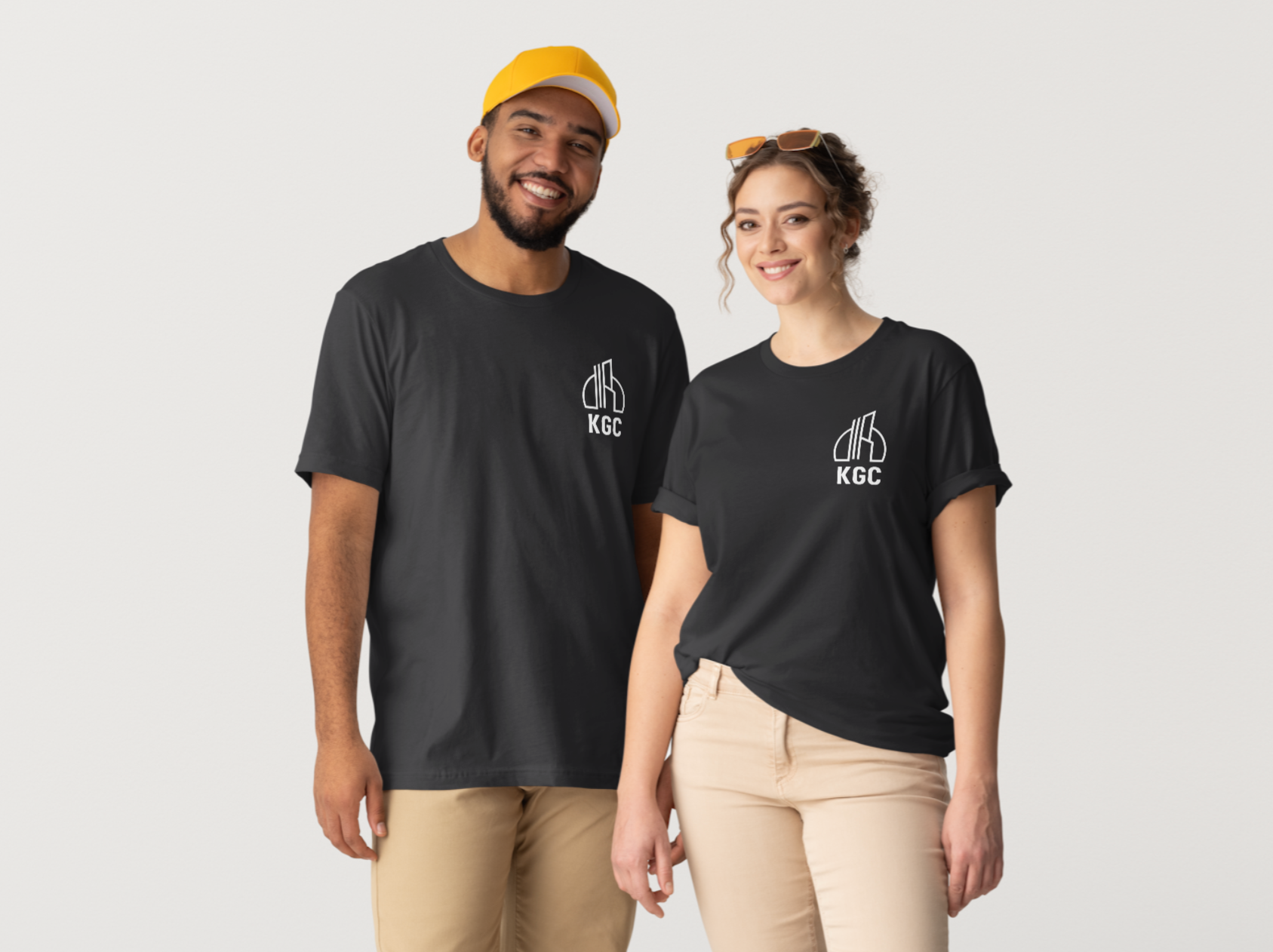
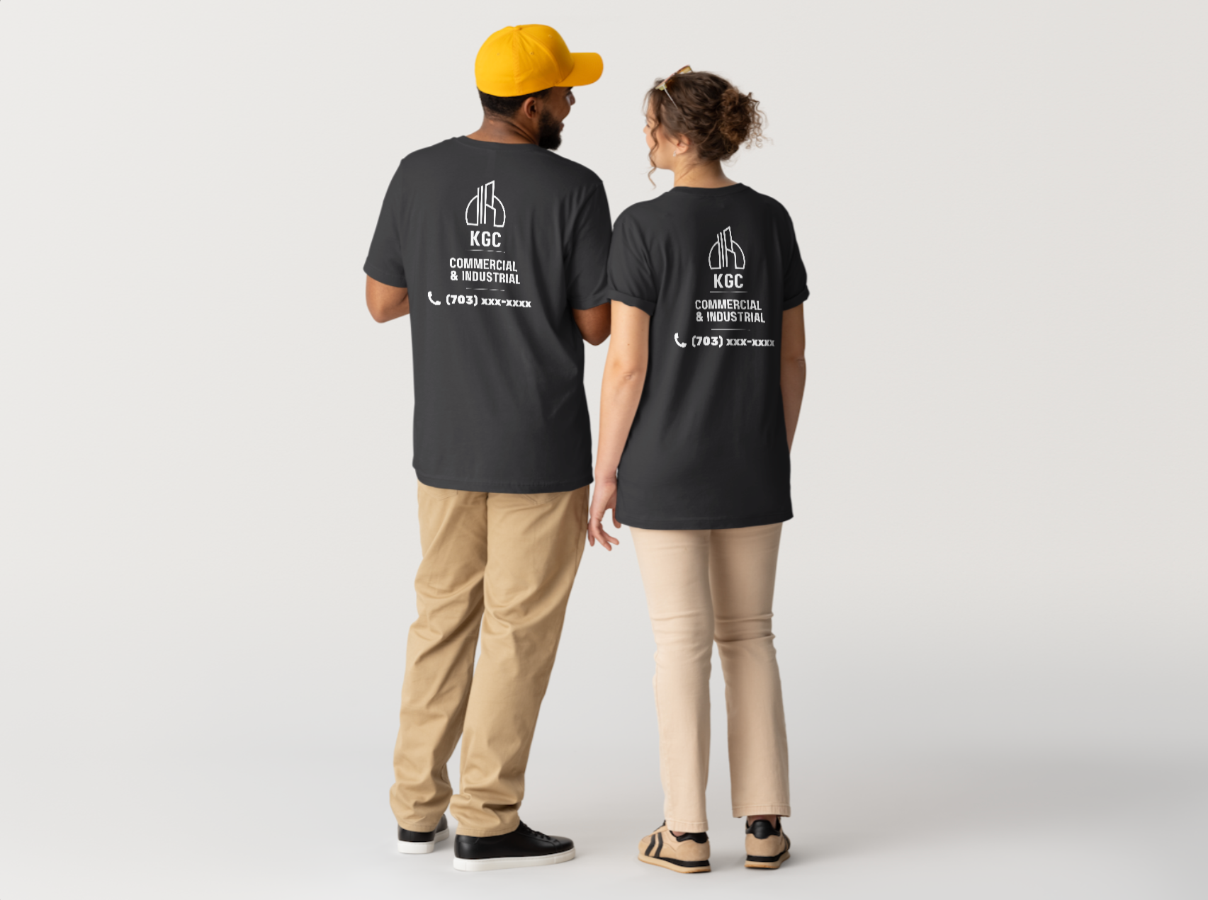
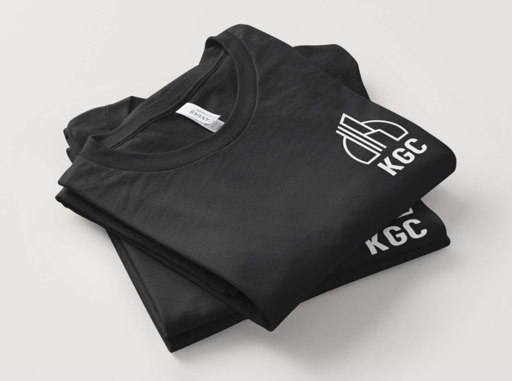
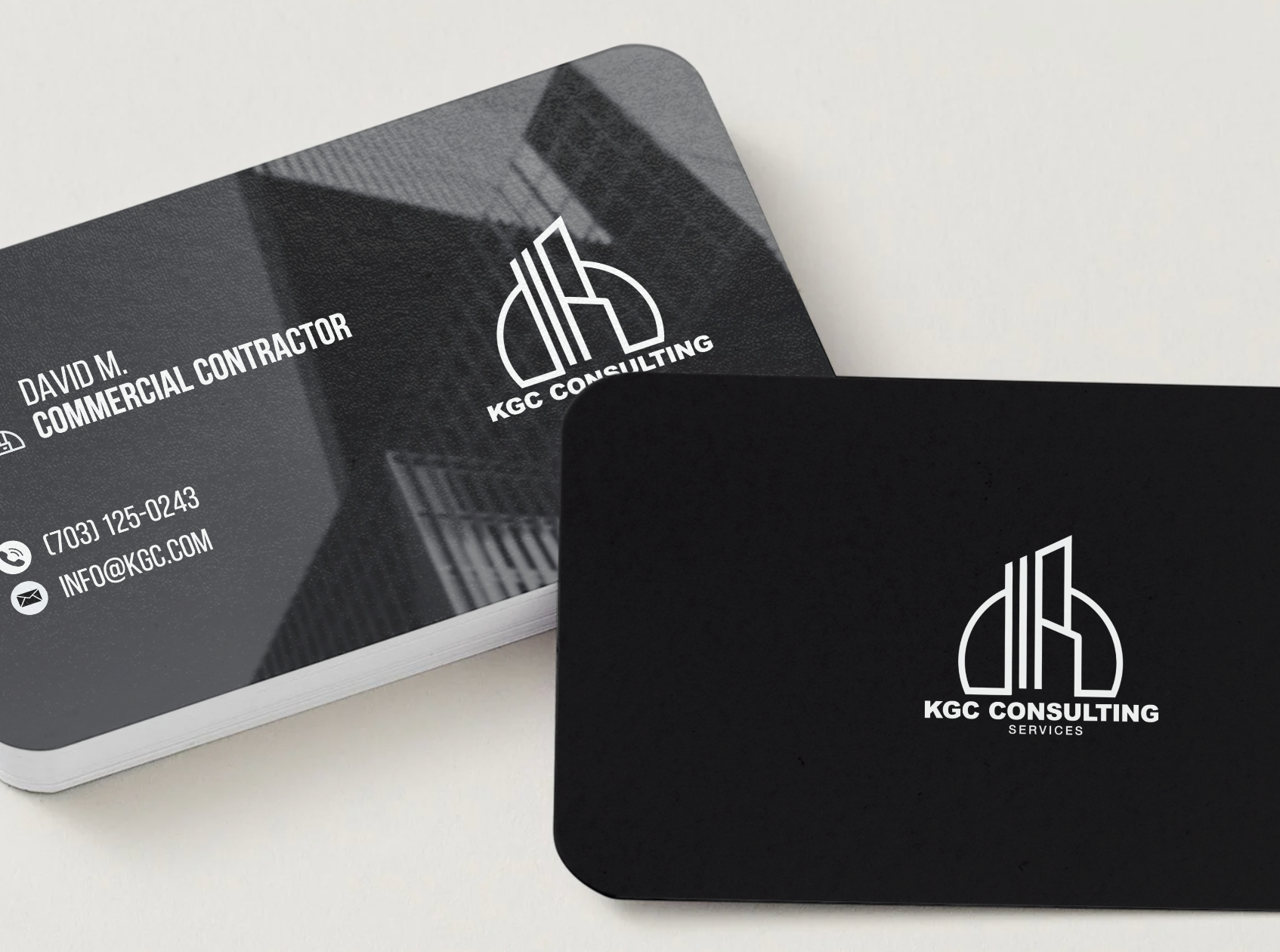
I designed custom black t-shirts with a front logo and a larger back design including the company name and contact information, increasing brand visibility and creating a cohesive, professional look for the team. I also customized a tech folio and created matching business cards to maintain a consistent visual identity across all materials.
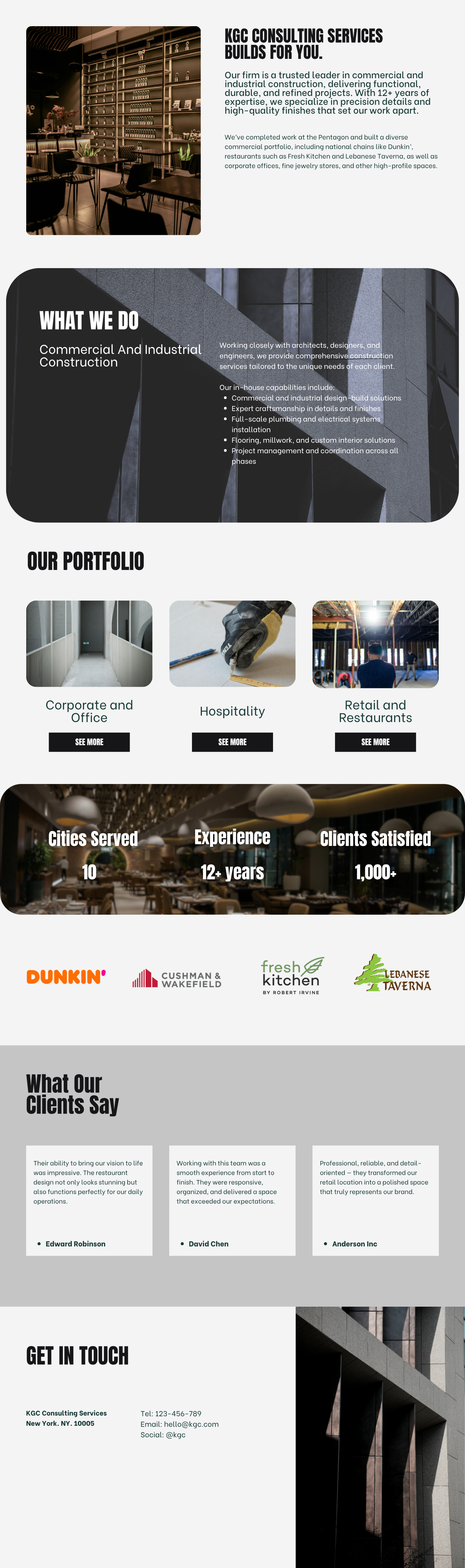
I designed the company’s website from scratch, creating a modern layout with soft, curvy containers to introduce the brand. The design feels clean and approachable while still maintaining a professional look, helping present the company and its services in a clear and engaging way.